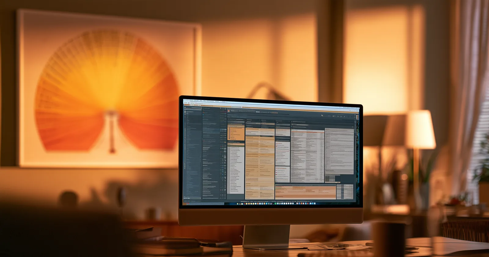
Genealogy software gets criticized for being ugly, dense, and intimidating. The criticism is accurate and it misses the point entirely.
These programs are built correctly for what they do. The problem isn't that they're bad at their job — it's that most people assume their job includes something it doesn't, and then feel let down by the absence.
Worth spelling out, because the gap is the most interesting thing in this field.
What research software is actually for
The job is evaluating evidence.
Genealogy is not data entry. It's an argument, built out of documents that disagree with each other, about who somebody was. A census says she was born in 1878. A baptism record says 1876. A death certificate says she was 71 in 1951. None of them is authoritative and all of them are evidence.
Software built for that job has to do things that look like flaws if you expect a picture:
It has to show uncertainty. A date that's confirmed and a date that's a guess must not look the same, or you'll build twenty years of research on a guess.
It has to show conflict. When two records disagree, the software's job is to keep both visible, not to pick a winner and hide the loser.
It has to attach evidence to claims. Every fact needs a source, and the source needs to be one click away, or you can't audit your own work.
It has to record process. What you searched, what you didn't find, what hypothesis you eliminated. Negative results are findings.
It has to be dense, because you're comparing things, and comparison requires having them on screen at once.
Every one of those requirements produces an interface full of small text, sub-panels, confidence indicators, and citation fields. That's not a design failure. That's what the job looks like when it's done properly.
What it isn't for
Showing your family to your family.
That job has requirements that are, item for item, the opposite:
It has to hide uncertainty, because a room full of relatives doesn't want confidence indicators. They want to know who she was.
It has to resolve conflicts, or at least pick one and move on. A display that shows three competing birth dates is showing its working, and nobody asked.
It has to hide the evidence. Sources are the substance of research and clutter on a wall.
It has to be legible from ten feet, which means large type and few elements — the exact inverse of density.
It has to work for someone who has never used it before, in one attempt, with no explanation, possibly while holding a drink.
You cannot satisfy both sets of requirements in one interface. Not because nobody has been clever enough, but because they contradict. Uncertainty visible and uncertainty hidden are not reconcilable states.
The thing to notice
Every other creative pursuit worked this out and built two separate things.
Photographers have Lightroom and they have prints. The editing interface is a wall of histograms, masks, and sliders, and the print on the wall has none of that — and nobody thinks the print is a dumbed-down Lightroom. It's the artifact. Lightroom is the workshop.
Musicians have the multitrack session and the record. Writers have the manuscript and the book. Woodworkers have the shop and the chair.
In each case the workspace is dense, specialized, and unpleasant for anyone who isn't doing the work — and nobody minds, because nobody confuses it with the output.
Genealogy is the field that never built the second thing. The workspace became the artifact by default, because for thirty years the only place a tree could exist was inside the program that made it. So the finished product of years of research is a login, and showing it to someone means showing them a workspace.
That's an accident of history, not a design decision anyone made. But it has consequences, and the main one is that the research gets seen by almost nobody. More on that argument.
What the missing category looks like
If the second thing existed, it would have a short, specific list of properties.
One family member at the center, changeable. Not a fixed print. Anyone on the chart can become the middle of it, because a fixed center means every other person in the room is looking at somebody else's story.
Legible across a room. Not a laptop passed around. The whole point is shared attention, which requires a shared surface.
No interface. Nothing on screen that isn't the family. Menus, sidebars, and toolbars are workspace furniture, and their presence is what tells someone they're looking at software rather than at their family.
Ambient by default. It should be visible when nobody has decided to look at it, because deliberate viewing happens a few times a year and incidental viewing happens constantly. That's the difference between a hallway photograph and a folder of scans.
Read-only, deliberately. If it can be edited, it's a workspace again, and every requirement above starts eroding to accommodate editing.
That last one is the constraint that makes the rest possible, and it's the one people find counterintuitive. The reason a display can be clean is that it doesn't have to support an argument about a birth date.
The disclosure, and the argument regardless
That list is a description of what we build, so read it with the appropriate suspicion. Bright Branches is a display for a family tree on a television — read-only, no interface, the tree sourced from FamilySearch, a GEDCOM file, or an Ancestry import, with research staying wherever you do research.
The argument doesn't depend on us, though, and you can act on it without buying anything. Print a chart. A framed six-generation fan is the original version of the second artifact, it's been the right answer for a century, and every program on the market exports one. How to print one properly.
The point isn't which second thing you make. It's that there should be one.
What this means for the research software
Nothing bad, which is the part worth being clear about.
RootsMagic, Gramps, Legacy, and the rest should not try to become display tools. Every step in that direction costs them something at the job they're actually good at, and the field genuinely needs software that takes evidence seriously. More on that category.
The same goes for the platforms. Ancestry and MyHeritage and FamilySearch should keep building research tools, because records and search are hard and they're good at them.
The gap isn't a failure on anyone's part. It's just a gap, and gaps get filled by something else. The mistake is only in expecting the workshop to also be the gallery — and then concluding, when it isn't, that you've reached the end of what's possible with twenty years of work.
Keep reading: