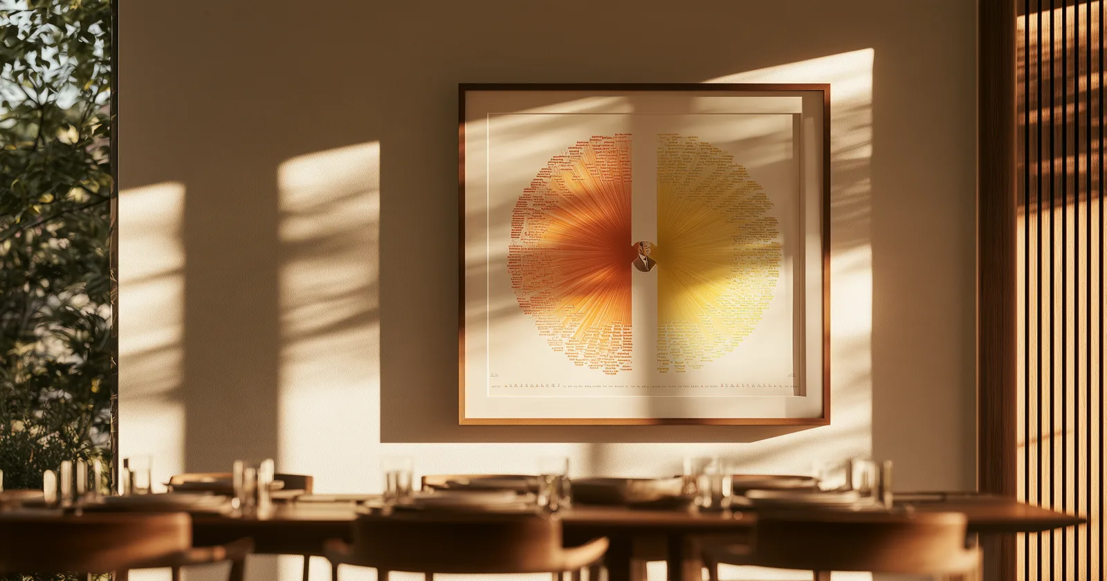
There's a moment at most big birthdays where the room runs out of things to do. The food is finished, the speeches are done, and thirty people are standing around in a hall with another hour to fill.
A family tree is unusually good at filling that hour — but only if it's the right shape. Most charts are the wrong one.
Why the shape matters here
The standard family tree is an ancestor chart: one person at the center, generations expanding backward. It's the right shape for documenting a line and it's what almost everybody prints.
For a milestone birthday it's slightly off, and the reason is worth understanding. An ancestor chart tells someone where they came from — which, at eighty or ninety, is a story about people who are all gone. It looks backward, and the room has gathered to celebrate somebody who is very much present.
The bow-tie fixes that. One person in the middle, ancestors streaming out one side, descendants out the other. Same person, same family, completely different message: here is where you came from, and here is what came after you.
That second half is the part that lands. Somebody who is ninety has spent a lot of time attending funerals. A chart that ends at them reads one way. A chart where they're the hinge — with three generations behind and three in front, half of whom are in the room — reads entirely differently. More on the three chart shapes.
How far in each direction
The two halves behave nothing alike, and this catches people out.
Backward is predictable. Every person has two parents, so the ancestor side doubles cleanly: 2, 4, 8, 16. Four generations back from an eighty-year-old reaches people born in the 1860s and 1870s, which is usually as far as the documentation goes anyway. Four is a good target. The arithmetic, if you want it.
Forward is chaos. Descendants don't distribute evenly — one child has four kids, another has none. A ninety-year-old with five children can easily have forty living descendants, and they will not lay out in a tidy arc. Expect the descendant half to be wider, messier, and harder to fit.
The practical compromise: four generations back, everything forward. The ancestor half gives the chart its structure and symmetry; the descendant half gives it the people who are actually standing in the room. Let it be lopsided. Lopsided is honest.
One warning: the descendant side is the half that will be wrong. Recent marriages, new babies, a grandchild's partner nobody has met. Check it with two different relatives before you print anything, because an omission on that side gets noticed immediately and by the specific person who was left off.
What to do with it at the gathering
Put it on a wall and let people find it. This is the whole play. Don't present it, don't gather everyone around it, don't make a moment of it. Hang it near the food and let people drift over. Family charts are self-organizing — one person stops to look, two more join, and within twenty minutes there's a group in front of it arguing about a date.
Have the honoree walk somebody through it. Not a speech. Just a grandchild asking who somebody is, and an eighty-year-old answering. This is the actual event, and it happens on its own if the chart is on a wall and nobody schedules it.
Run the oldest-person question. Go around and ask: who's the oldest person here, who's the youngest, and who's the oldest person anyone in this room ever met. At a ninetieth, the honoree almost always wins that last one by a wide margin — they met people born in the 1870s. That's two handshakes to a world nobody else in the room can reach, and it reframes the person of honor from "the old one" to "the one who was there." More formats along these lines.
Put out paper and let people correct it. Someone will know a date you got wrong. Someone will know a story about a name in the outer ring. Have a pad next to the chart, and you'll leave with better information than you arrived with.
On the wall afterward
The chart outlasts the afternoon, which is most of its value.
A printed bow-tie in a frame is a straightforward thing to produce — every genealogy program exports charts, and standard frame sizes cover it. How to print one properly. It goes up in the hallway and it gets looked at for years by people walking past, which is more attention than any family tree gets in a folder.
The one real limitation of printing it is the one every printed chart has: the center is fixed forever. Your chart has the honoree in the middle, and everyone else on it — every grandchild, every in-law — is a supporting character in someone else's picture.
On a screen that isn't fixed. Any person on the chart can become the middle of it, with the whole thing rebuilding around them, so the grandchild who asked who somebody was can put themselves at the center and see their own version. Two of the five designs we build are bow-tie shapes for exactly this reason — it's the shape people want when the subject is a person rather than a lineage.
Print the one for the wall. The screen version is for the hour after the food, when there are still thirty people in the room and nothing scheduled.
Keep reading: